I recently created a (digital) garden, a (safe) space to vent off an unexplored passion for prose and creative writing in general. The idea and design motivations came from childhood nostalgia, lack of an audience on popular social networks and pretty sites across the internet.
Setting the mood
When we picture a garden, we visualize a lot of things (nope, not the cabbage patches...the aesthetic kind). I like to think of it as a place of tranquility and carefully tended outlook, minimalistic yet has just enough features to make it enjoyable without being overwhelming.
Pastel colors for a calming effect
Bright colors are nice, but they certainly don't belong in an environment that aims to draw less attention to itself. Pastel colors on the other hand, have just the right emotive value; soothing and pleasant to the eye.
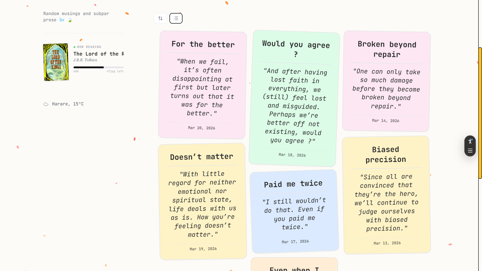
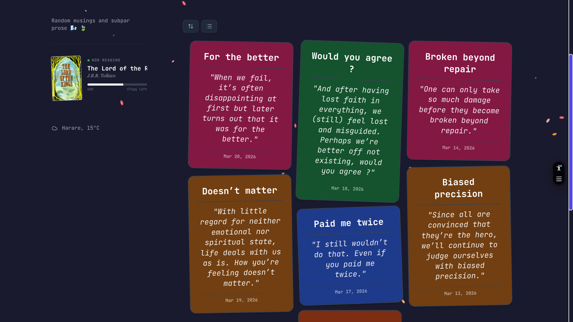
The cards make use of random pastel colors to make each entry look unique. In dark mode, this was a bit more difficult to maintain since colors tend to look a bit off when you try to make them dark mode compatible (i.e they divert from the original hue to match contrast guidelines). I think the garden looks more calming and cozy in light mode, but of course, preferences differ:
Here's the site in light and dark mode respectively:
Letting the content breathe
What's the best way to make users focus on the content and less on the design ? Whitespace.
Whitespace should give the user the freedom they need to look around without getting distracted with other visual elements. It gives the user a chance to breathe. You can see that overally the site utilizes this idea on the main page:
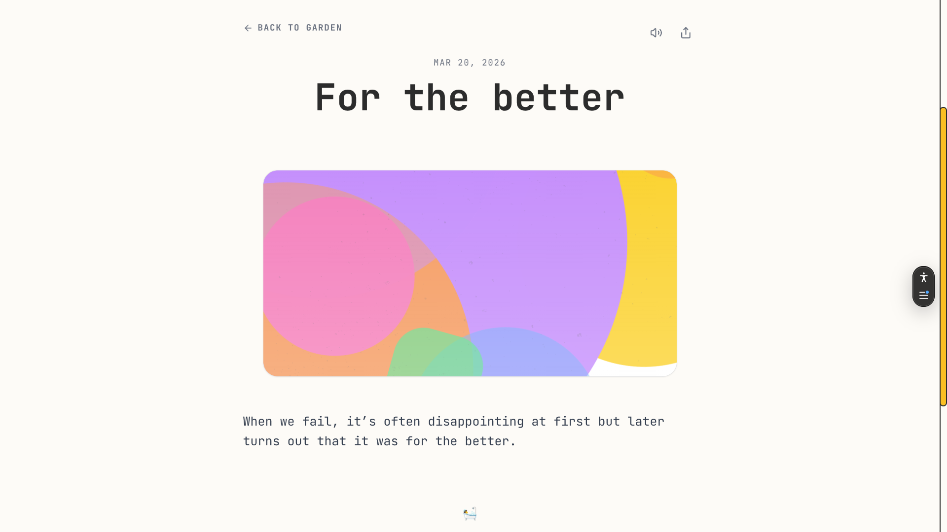
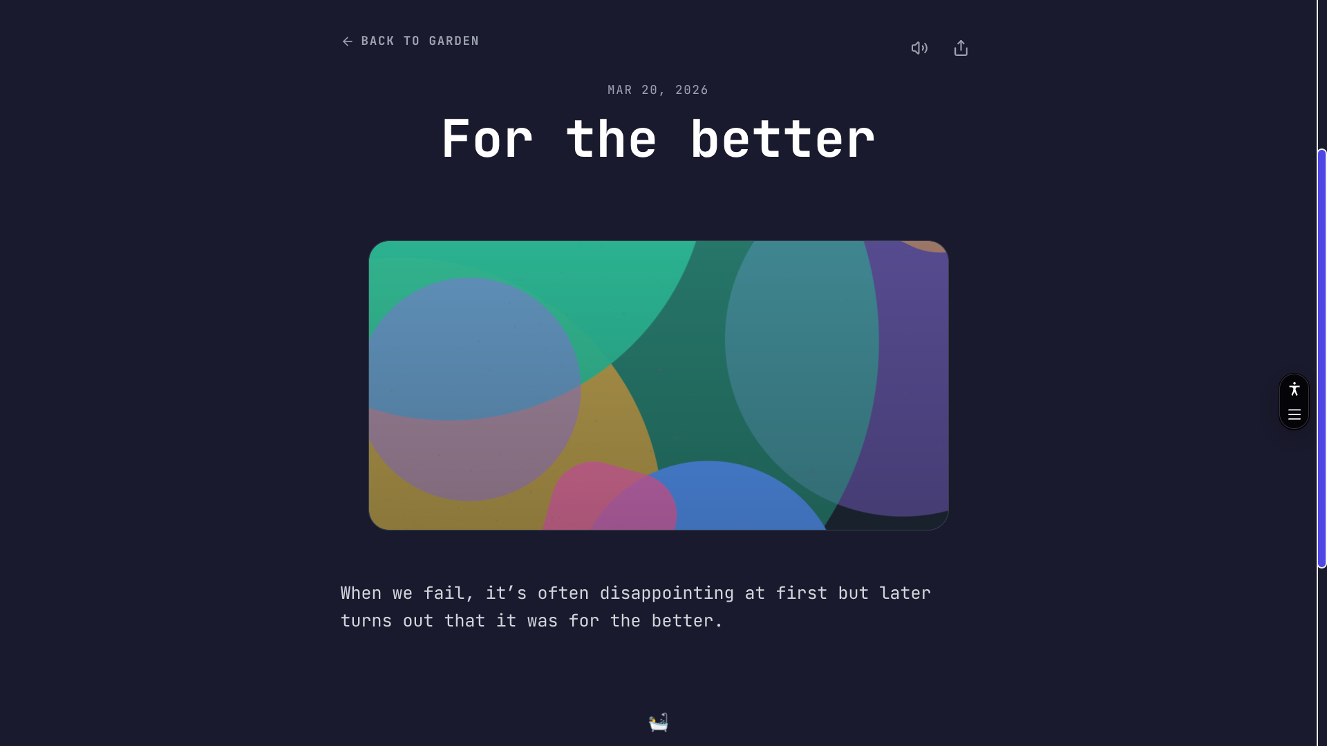
The full post view is also minimalistic by intent, very few icons and lots of space around the elements on the page. The reason behind this is that the content per unit has very few words so why clutter the presentation, we want the focus to be on the words, not the surrounding design.
Subtle animations
I tried to not go overboard with the animations. Visual cues tend to become monotonous when overused or applied in wrong contexts and I tried by all means going down that route.
What aspects did I wish to animate ? Wanting the user to feel like the elements were unveiling before their eyes, I resorted to making the navigation (next/prev post buttons) and the random emoji fade in after a delay when the user scrolls these elements into view.
Different ways to preview lists
I wanted to make sure that the content would be easy to browse through or if need arise, to jump to a specific date (since each day has its own post).
The garden has three views to navigate the content:
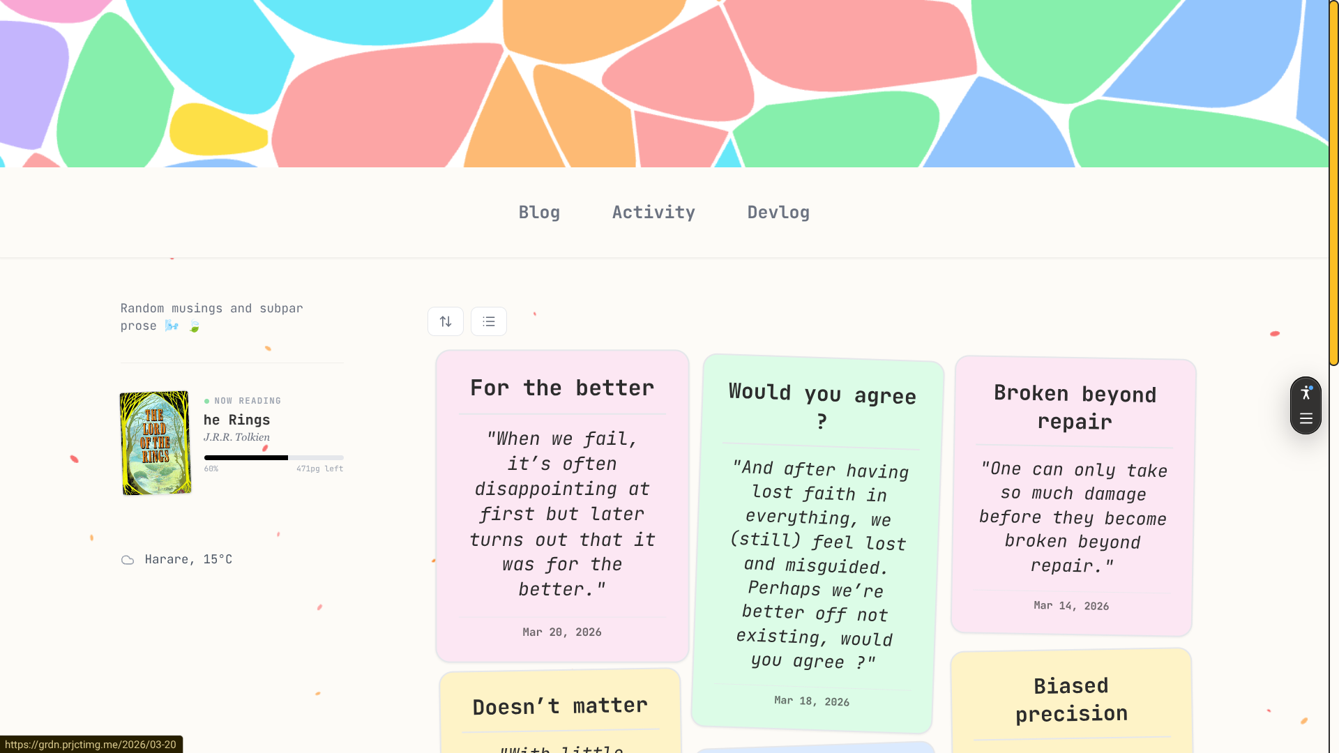
Cards (grid)
This is the default view when the user navigates to the site, it shows the posts as a grid of cards. Each page has a maximum 7 cards (the number symbolifies completeness , for instance, a week has seven days).
This view takes advantage of the pastel colors we used on the header graphic, giving the site a consistent feel in terms of color application.
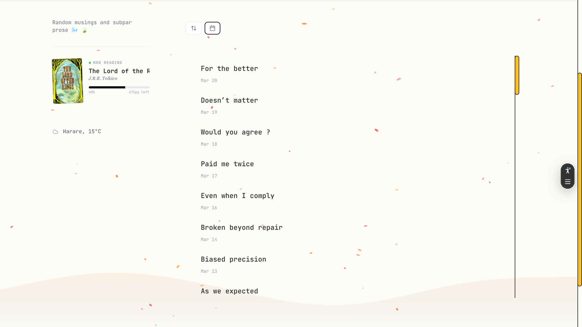
List
The list view is perfect for browsing through the posts without paying attention to their content, since it only shows the titles. It is not paginated unlike the card grid view.
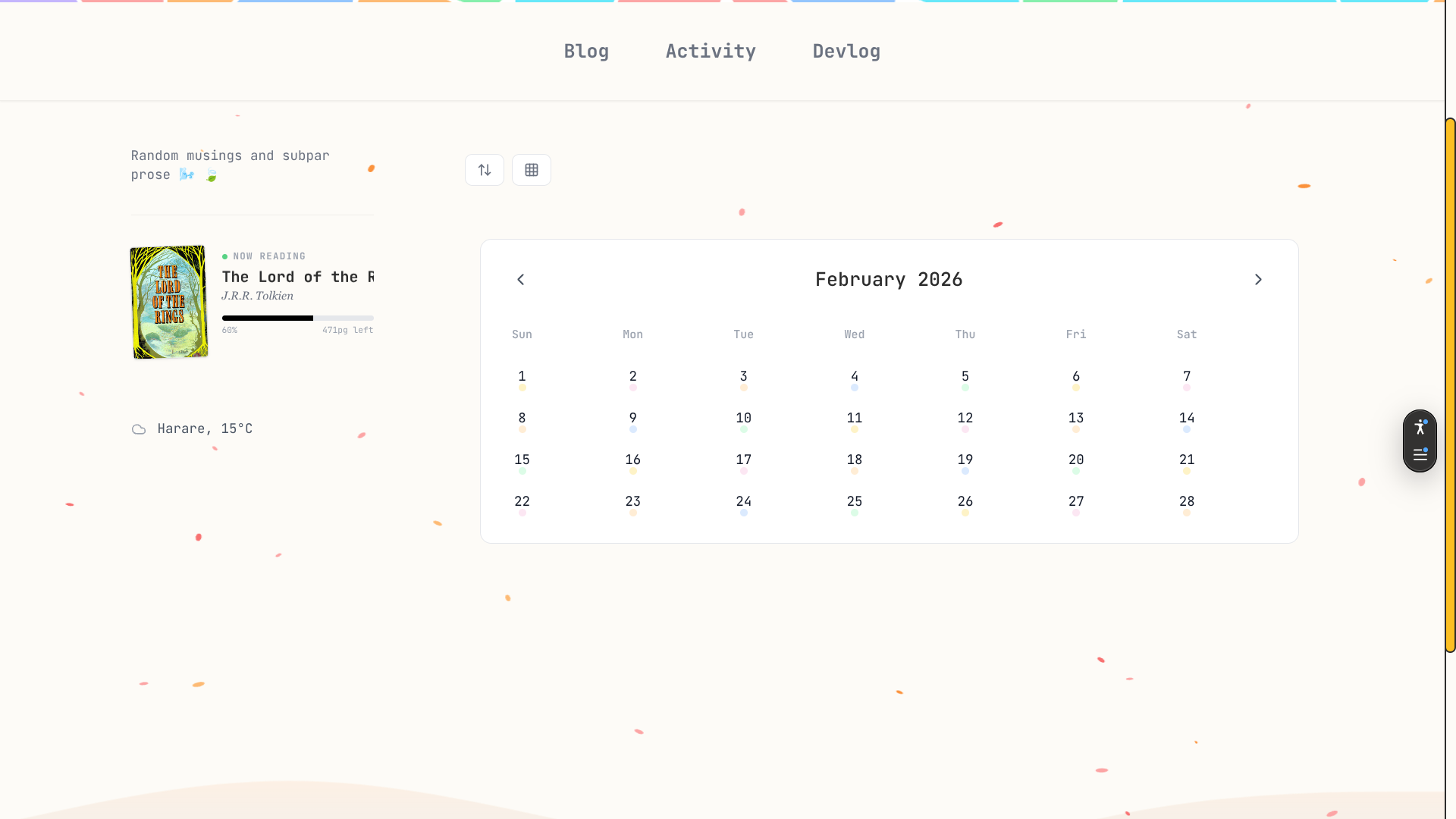
Calendar
I added this view as an after thought after reflecting on how the nature of the content was a natural fit for this type of navigation. The grayed out dates do not have a post associated with them,and when you click on a date that has a post, it will take you to the post written on that day.
As a side note it helps me keep track of any days that I may have skipped since the goal is to have a perfect streak (365 posts in a year).
Tending a garden
Keeping the content evergreen is a priority, a garden must be timeless immune to changes in trends.
My approach is a daily morning reminder that tells me to create the day's post which I draft and publish all from the Obsidian app on my phone. This means I can even post when my computer in
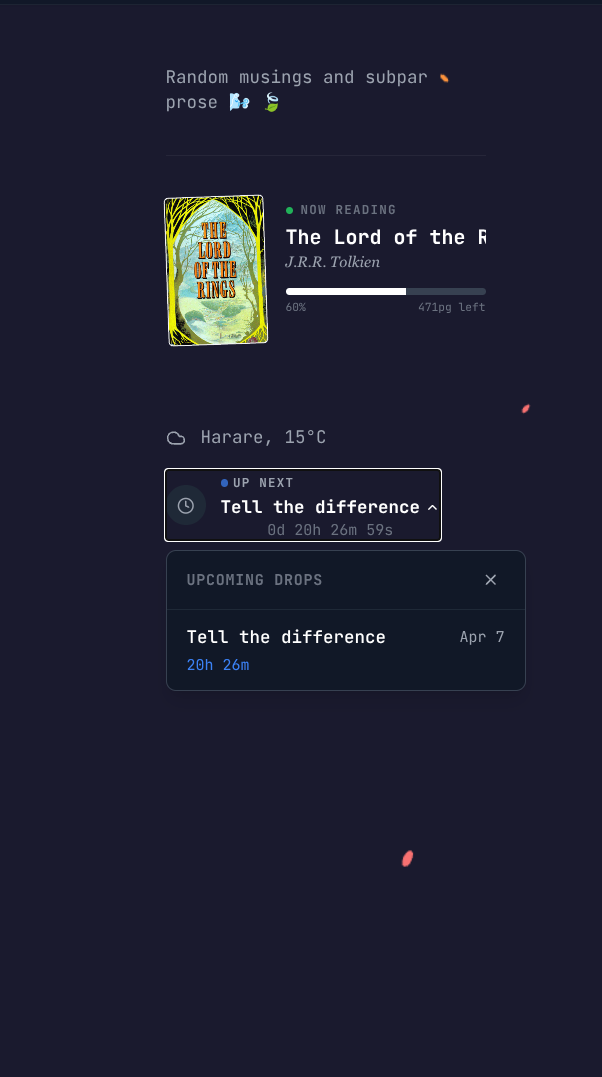
I schedule my posts to publish themselves in advance by writing for days in the future, when I commit these posts to my repository, they reflect on the site as "Upcoming" and displays the titles along with the remaining time (I got this idea from the Slowly app)
Takeaway
Keeping a garden is not for everyone (just like all things) and its important to understand that it's not something that should make you pop a vein when maintaining it.
In this space, time must have no wearing effect on the content...perhaps only make it age like fine wine and someday be an archive of how I thought in my youth.